UX/UI Design, Internal Tools, Logistics Dashboard
Logistics Dashboard - art handling companyidentifying the problemIn this project, I was tasked by the Logistics team to redesign a key system they utilize. The Logistics team at my company’s role is to oversee scheduling of staff and the truck fleet. In a recent in house application redesign the development team wanted to create a one stop dashboard that would allow the team to access all of the pertinent information, reports, and staffing tools needed in one place. A beta version of the application was released using the Zoho CRM suite and Zoho Creator application building tools. In the first month of the beta release there were some bumps in the road occurring with the applications usability and purposefulness. My task was to then meet with the Logistics team to discuss how we could improve the dashboard application to better meet their day to day needs.
Inventorying the ComponentsI needed to break down the components of the application dashboard into something that could be rebuilt from the atomized list of what is needed.
Components
Locations Filter
External Button Links to Other Pages
Google Calendar
Keep Truckin
BoL Report
Fleet Report
Teams Report
Job Calendar
Staff Directory
Out Report
Availability
Build Shuttle Tool
Create Slots Tool
Update Availability
Days Off Report
All Transport Staff List
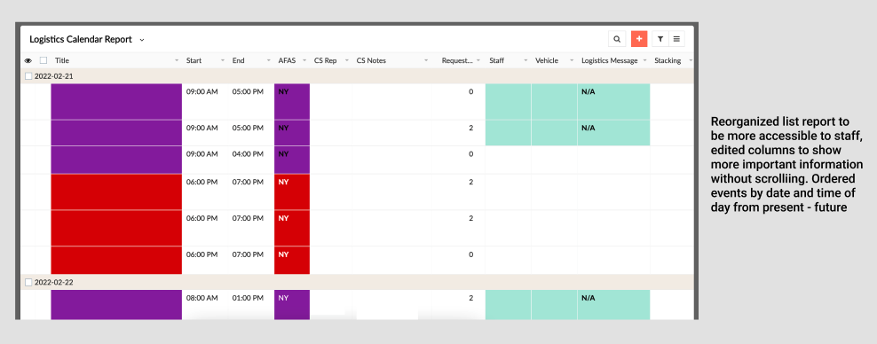
Logistics Calendar Report
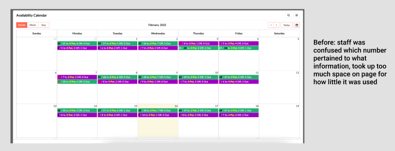
Availability Calendar
Identifying Use and Developing AssumptionsTo better understand the team's use of the application I had to dive in and use it myself. I developed a list of assumptions, assumptions into the priority of tasks the team tackles on a daily basis and assumptions into the path of their workflow throughout the application. This is an application that is exclusively accessed on laptop or desktop computer.
Primary Tasks
Assigning Staff to Jobs
Adjusting Staff Availability
Communicating Staff Needs to Client Services
Secondary Tasks
Maintaining Teams/Pods
Adjusting “Out” Report
Viewing and Sending BoL’s (bills of lading)
Developing Research QuestionsGoals of the research session
Streamline day to day processes of the Logistics Team
Allow for easier communication between Logistics, Client Services, and Transport team
Allow for better tracking of available staff and trucks
I needed to develop a short script of questions that I could ask each staff and start the conversation around how they use the application, identifying their pain points, and improving the overall workflow.
What are your primary work tasks?
What is the first thing you look for when opening this page? Second?
What are your various reasons for accessing this page?
Could you walk me through your workflow on this page?
What do you feel is missing from this page?
What if anything do you feel is unnecessary on this page? Are there any components that you do not use?
Are there any existing fields on this page that could be made to work better for you?
What devices are you using to access this page?
Are there any existing training materials that are available to you regarding this page or your work tasks?
Feedback from Usability SessionsHaving the staff demonstrate their workflow and talk through the decisions they were making live was eye opening not only to myself but also the staff themself, because two key things were realized.
The staff is often keeping 3-4 tabs open at once of all of the necessary reports and staffing calls they need to correctly complete their tasks, and they often felt embarrassed or had to slow down their process to walk us through all of the tab and screen jumping. Even when some of this information was thought to be made available by the development staff on the dashboard itself, it was oftentimes either being viewed in a different format that the logistics preferred, or not in an easy to access space on the dashboard itself.
The staff sometimes did not even know that certain information was available to them on the dashboard. And this of course was not to their fault, rather this information was getting lost in a sea of other less necessary information, so the staff simply thought it would be easier to access what they need in another tab or fashion that they were more familiar with.
“Can the staff assignment, truck assignment, and CS notes be listed in the quick view pop up when hovering over a calendar event?”
“We are still using the old spreadsheet for updating staff availability, and now trying to keep up with this one as well. It’s a recipe for disaster for mislabeling?”
“Can the availability bar change or update as assignments are made?”
“There is a form for Client Services to message Logistics specifically with notes, can there also be the same thing in reverse?”
“I staff for two separate locations and have to jump back and forth between the two, could I sort the view to show multiple locations at once?”
“Could we have a way to be notified when jobs are canceled and need to not be staffed or assigned”
Integrating, Updating, Improving, MinimizingReturning the results to our development team was an easy and pain free experience, as a lot of the changes that needed to be made were cosmetic. After the initial hide/show function editing on the back-end to clean up the columns in various reports, we met to create a pipeline order for anything changes that remained, deciding based off of the needs of the team we worked with which features were priority fixes and which ones were more long term projects that would require time for us to step back and analyze where else the same changes could be integrated into other parts of our system.
Some annotated screenshots of the dashboard in its current state are shown above.


